Case Study: The LA Leggers Rebranding
The LA Leggers is one of the largest non-profit running and walking clubs in Southern California with more than 1,200 members. Established in 1989, the club has trained runners and walkers to participate in the annual Los Angeles marathon and other races with various distances every year since. In 2022, I was asked to redesign the club logo (the first redesigned logo in the club’s 34-year history), website, running apparel, newsletter, and more. The goal of this major marketing effort was to refresh the club’s image, expand its reach to Angelenos of all walks of life who are interested in running or walking and overall fitness, and community building.
As a designer who has worked in the marketing field for several years and a runner myself, this Leggers branding case study reflects my extensive skill set, graphic design experience, web development and marketing, and my passion for running.
Overview
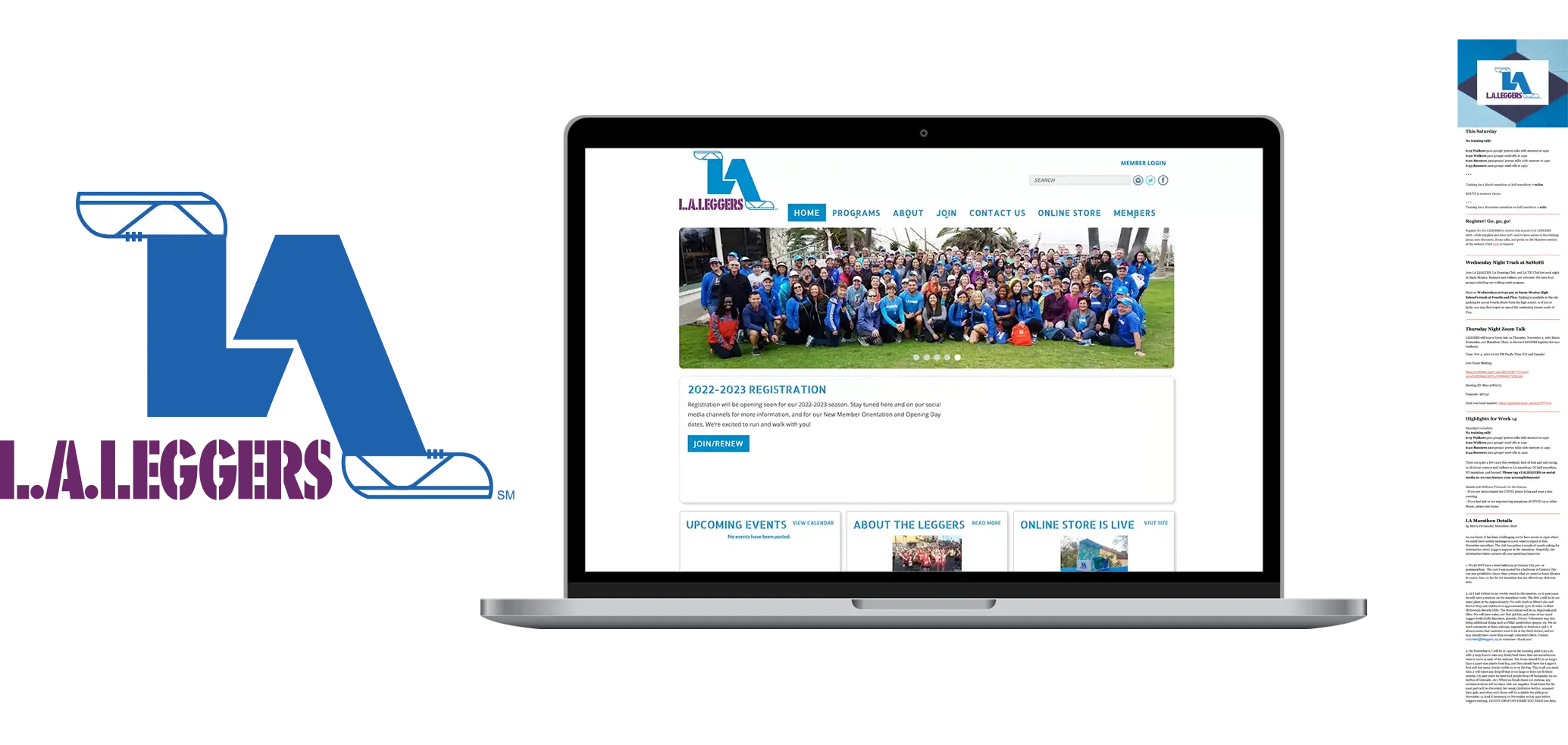
- Logo: Since its inception in the late 1980s, the Leggers had used the same logo for many decades. While the logo served its purpose, it was time for a makeover to catch up with the times — to make it more youthful and modern-looking. The board of directors and club members wanted a new logo that expressed strength, speed, and steadiness.
- Website: The front-end site had been through a few major changes over the years, but all those versions had the same UX issues. They were difficult for users to navigate, weren’t responsive on different devices, were slow to load, and were aesthetically unappealing, and SEO was almost non-existent. These issues gave the site a very low Google Quality Score, therefore, low ranking on the Google SERP.
- eNewsletter and Club Apparels: The weekly eNewsletter, one of the main communication channels the club uses to connect with members, wasn’t cohesive and didn’t adequately represent the brand. The eNewsletter also needed a redesign that matched the new branding and included new responsive features.
BEFORE: Old Logo, Website & eNewsletter
Approach
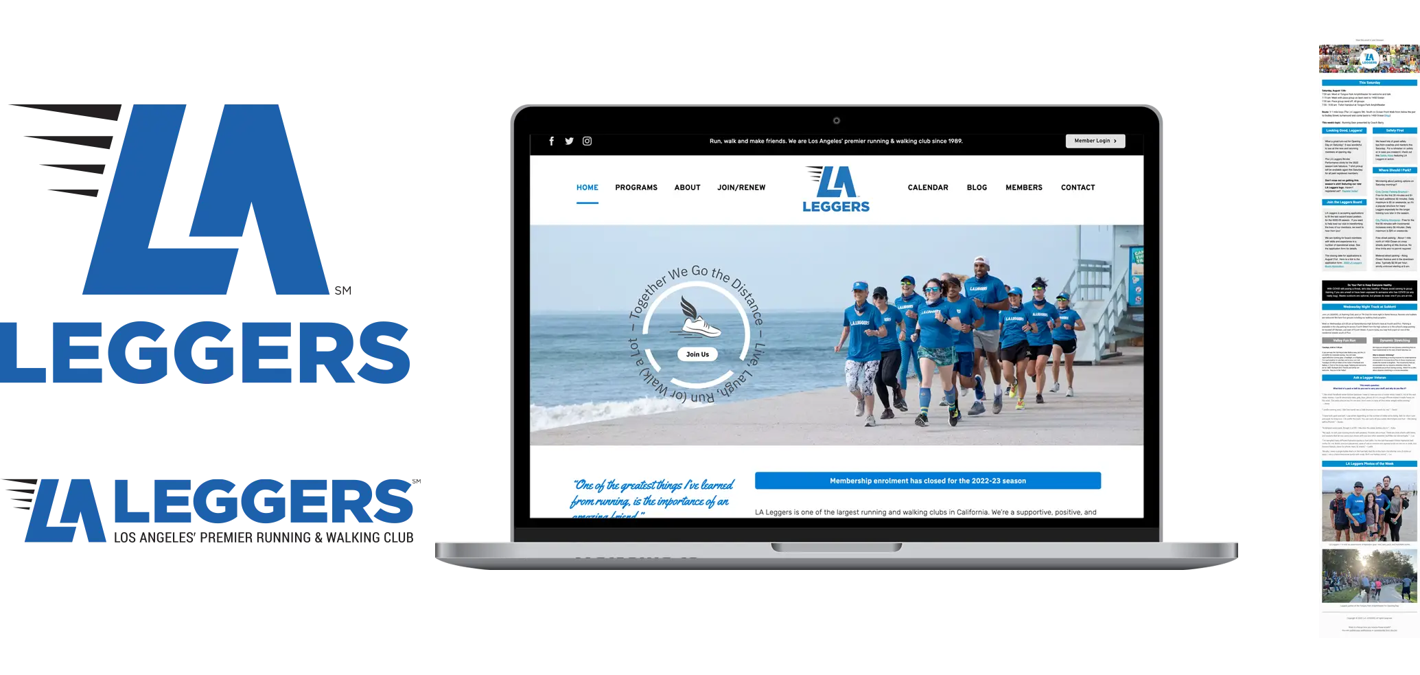
- Logo: Since blue has long been associated with the Leggers, that color stayed. I changed the purple color to black and somewhat kept the stacked composition of the original primary logo. I presented three design versions to the board of directors, and one version got immediate approval.
- Website: The new site was a complete departure from the old one: new CMS, new graphics, new photography, which included lots of photos I’d taken for the club, a new hosting service, and more. I also added a lot of new features and functionality to the site that it didn’t have before to provide a better user experience and improve the site’s performance: photo galleries, testimonials/member stories, FAQs, countdown counters, a calendar, a blog, reCAPTCHA 3, Google Maps API, map image hotspots, GA4 tracking, Yoast SEO, structured data, and so on while adhering to web best practices to make the site load fast, ADA compliant, responsive and rank higher on the Google SERP.
Results
Highly ranked on Google Search Engine Result Page (SERP) |
Vast improvement on site accessibility, best practices, and SEO |
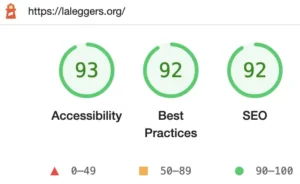 Snapshot of the Google Lighthouse site report for the new Laleggers.org site I built. This is the first time this organization’s website achieved an A grade on all these essential aspects.
1.4X increase in new and first-time member enrollment |
AFTER: New Logo, Website & eNewsletter
Conclusion
Overview
- Logo: Since its inception in the late 1980s, the Leggers had used the same logo for many decades. While the logo served its purpose, it was time for a makeover to catch up with the times — to make it more youthful and modern-looking. The board of directors and club members wanted a new logo that expressed strength, speed, and steadiness.
- Website: The front-end site had been through a few major changes over the years, but all those versions had the same UX issues. They were difficult for users to navigate, weren’t responsive on different devices, were slow to load, and were aesthetically unappealing, and SEO was almost non-existent. These issues gave the site a very low Google Quality Score, therefore, low ranking on the Google SERP.
- eNewsletter and Club Apparels: The weekly eNewsletter, one of the main communication channels the club uses to connect with members, wasn’t cohesive and didn’t adequately represent the brand. The eNewsletter also needed a redesign that matched the new branding and included new responsive features.
BEFORE: Old Logo, Website & eNewsletter

Approach
- Logo: Since blue has long been associated with the Leggers, that color stayed. I changed the purple color to black and somewhat kept the stacked composition of the original primary logo. I presented three design versions to the board of directors, and one version got immediate approval.
- Website: The new site was a complete departure from the old one: new CMS, new graphics, new photography, which included lots of photos I’d taken for the club, a new hosting service, and more. I also added a lot of new features and functionality to the site that it didn’t have before to provide a better user experience and improve the site’s performance: photo galleries, testimonials/member stories, FAQs, countdown counters, a calendar, a blog, reCAPTCHA 3, Google Maps API, map image hotspots, GA4 tracking, Yoast SEO, structured data, and so on while adhering to web best practices to make the site load fast, ADA compliant, responsive and rank higher on the Google SERP.
Results
Highly ranked on Google Search Engine Result Page (SERP) |
The most common keyword users enter when searching for a running club in Los Angeles is “Los Angeles running club.” Even without the help of paid search, the website I built for the LA Leggers organically and consistently places 3rd on the SERP (only behind a blog directory post of all running clubs in Los Angeles and another running club with the official name “Los Angeles Running Club.”) It’s worth noting that the website I built now places much higher on the SERP than the McCourt Foundation’s website for the Los Angeles Marathon, which offers training programs for the LA Marathon. This is a significant improvement for the LA Leggers, considering the old website placed 12th (fell on page 2 of the SERP and got buried below several small clubs and running groups in the city, making it difficult to be found).
Vast improvement on site accessibility, best practices, and SEO |
 Snapshot of the Google Lighthouse site report for the new Laleggers.org site I built. This is the first time this organization’s website achieved an A grade on all these essential aspects.
1.4X increase in new and first-time member enrollment |
Club members’ average age is also going down — from 45 (last year, before the new site was launched) to 38 (this year, after the new version launched). New and younger members indicate the club has made inroads with the younger demographic, which is an important part of the club’s future. Survey results showed new members found the club through web searches and were pleased to see how professional the club appeared on the user-friendly website.
AFTER: New Logo, Website & eNewsletter

Conclusion
The LA Leggers Rebranding: New and Improved
The LA Leggers Rebranding:
New and Improved
Loc is one of the most talented designers and digital marketers I've come across in two decades. As president of the L.A. Leggers running club, I asked Loc to create and implement a new brand identity for the club, including website, logo redesign, as well as design of our visual assets such as new tee-shirts, e-newsletter and pop-up tent.
Not only did Loc do this with exceptional ability, skill and empathy, he continuously created proactive recommendations that we ultimately implemented. Our website is performing well - far above other running clubs in terms of SEO and UX.
Loc has brought professionalism and class to our organization. I cannot recommend him more highly for any digital marketing or visual design work. He is in a class of his own and is an asset to any organization or client he works with.
